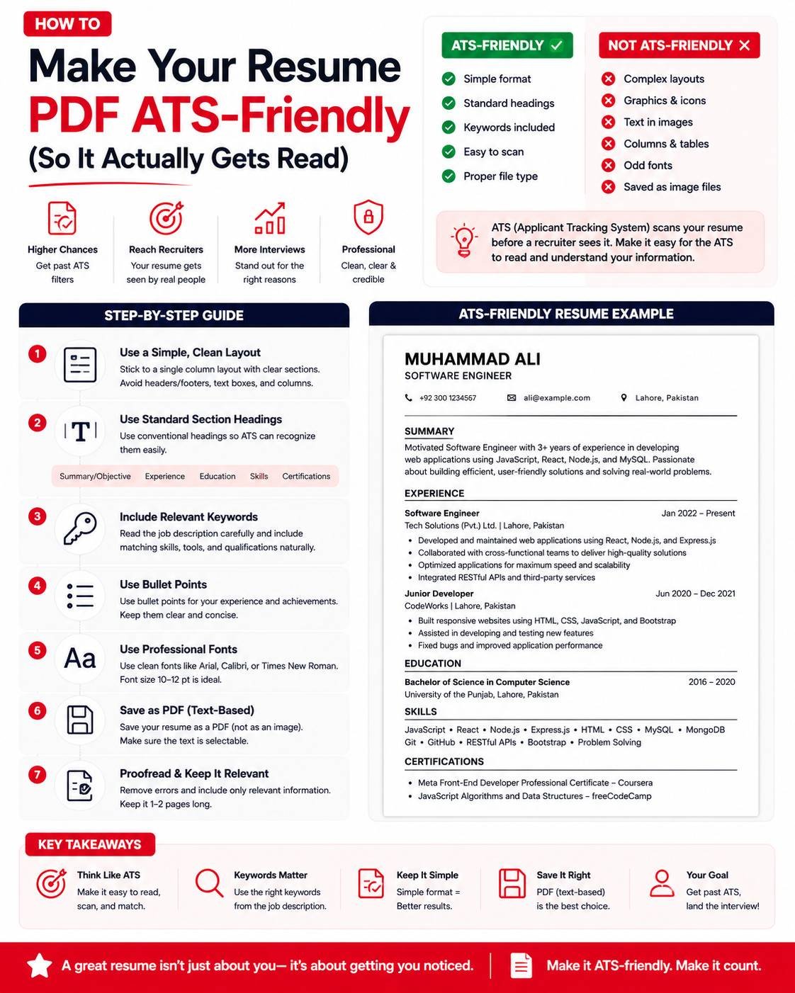
How to Make Your Resume PDF ATS-Friendly (So It Actually Gets Read)
Most job applications today don’t go straight to a human recruiter first — they pass through an Applicant Tracking System (ATS) that scans and parses your resume before a person ever sees it. A beautifully designed resume can score poorly if the ATS can’t correctly extract your information from the PDF, which means qualified candidates get filtered out simply because of formatting, not experience. Here’s how to make sure your resume PDF gets read correctly.
What an ATS Actually Does
An ATS scans your resume, extracts text (name, contact info, work experience, skills, education), and organizes it into a searchable database. Recruiters then filter and search this database using keywords relevant to the job. If the ATS misreads your resume — merging sections together, missing your job titles, or failing to extract text at all — your application can get ranked poorly or skipped entirely, regardless of how qualified you actually are.
Common Formatting Mistakes That Break ATS Parsing
- Multi-column layouts — ATS software often reads left to right, top to bottom, across the entire page width, which scrambles two-column resumes into nonsensical text order
- Text inside images or graphics — if your contact info or skills are embedded in a designed graphic rather than actual selectable text, most ATS systems can’t read it at all
- Tables used for layout — some ATS parsers struggle with table structures, sometimes dropping or reordering the content inside them
- Headers and footers — contact information placed in a document header or footer is sometimes skipped entirely by ATS parsers
- Unusual fonts or heavy styling — decorative fonts can sometimes be misread as different characters during text extraction
How to Build an ATS-Friendly Resume
- Use a single-column layout — keep all content flowing top to bottom in one column rather than splitting into side-by-side sections
- Use standard section headings — “Work Experience,” “Education,” “Skills” rather than creative alternatives like “My Journey” or “What I Bring”
- Keep contact info in the main body, not in a header/footer, so it’s reliably captured
- Avoid embedding text inside images — any graphic elements (like a skills bar chart) should be backed up with the same information in plain text form
- Use standard, widely available fonts — Arial, Calibri, Times New Roman parse more reliably than decorative or uncommon fonts
- Save as PDF, not as an image-based scan — the PDF must contain actual selectable text, not a scanned image of a printed resume
Verifying Your PDF Is Actually Text-Based
Before submitting, confirm your resume PDF isn’t accidentally an image:
- Open the PDF
- Try to select and highlight a line of text with your cursor
- If you can select individual words normally, it’s text-based and ATS-readable
- If nothing highlights, or the whole page selects as one block, it’s likely an image — which most ATS systems cannot read at all
Keyword Matching Still Matters
Beyond formatting, ATS systems typically rank resumes based on keyword relevance to the job description. This doesn’t mean stuffing your resume with keywords unnaturally — it means genuinely mirroring the terminology used in the job posting where it accurately reflects your experience. If a job description repeatedly uses “project management,” but your resume only says “coordinated tasks,” an ATS keyword match may miss the connection even though the meaning is similar.
Compressing Your Resume PDF Without Breaking Formatting
Many application portals cap resume uploads at 1-2MB. If your resume PDF includes a headshot or graphic elements pushing the file size up, compress it before uploading — but choose a light or medium compression setting rather than high, since aggressive compression on text-heavy documents can occasionally affect font rendering or clarity when the ATS extracts the text.
A Quick Pre-Submission Checklist
- Single-column layout, no side-by-side sections
- Standard section headings (Experience, Education, Skills)
- Contact info in the main body, not header/footer
- Text is selectable, not an embedded image
- Standard font used throughout
- File size under the portal’s specified limit
- Saved and named clearly (e.g., “FirstName_LastName_Resume.pdf”)
Final Thoughts
A visually striking resume design doesn’t matter if the system reading it first can’t correctly parse the content. Sticking to a clean, single-column, text-based PDF with standard headings and fonts significantly increases the odds that your resume gets accurately read and properly matched against the job’s keyword criteria — giving your actual qualifications a fair chance to be seen by a human recruiter.